Pictures are more attractive

The more people understand purpose, vision and strategy, and appreciate how they support these, the more likely it is that the organisation will deliver effectively. This makes intuitive sense and is borne out by consistent correlations between employee engagement and performance. Understanding of purpose and strategy, and my contribution, is a recurring theme in employee engagement metrics.
But how to make this high-level communication engaging, so that people feel inspired and motivated to participate, and to take ownership of higher-level goals? The advantage of a visual approach is that it is more attractive and engaging.
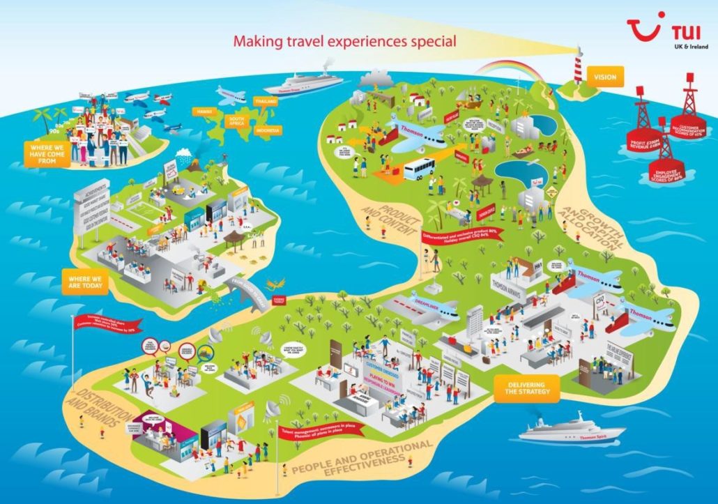
Contrast the two images below. The first is an outline that shows a vision built on three core themes supported by specific objectives (some of the detail has been omitted to protect confidentiality). The one that follows is a picture telling a story featuring vision, strategy, objectives and tactics.
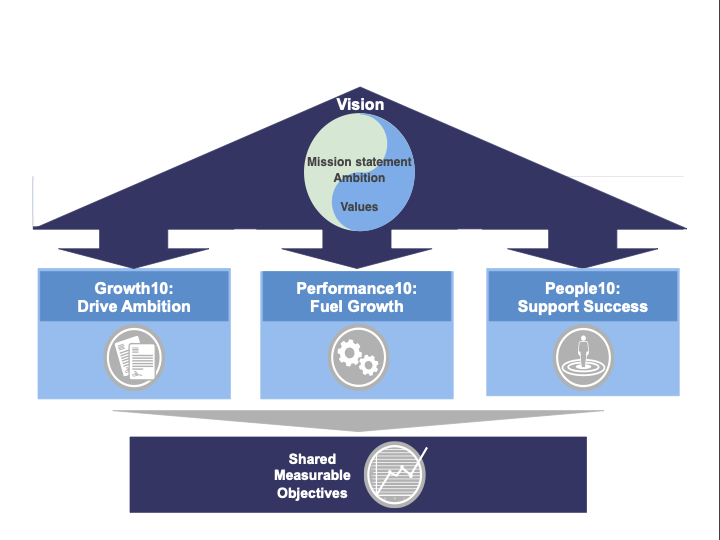
Numerous businesses use imagery like the first above: a house, a temple with pillars, a pyramid, or a series of circles. These images conceptualise at a high level and aim to convey the linkages between these different concepts; e.g., how the objectives support different strategies; how values underpin behaviours etc.
In contrast the second image – the island picture – conveys a narrative telling a story for this travel business of the company’s history, why it needs to change, the key themes in its strategy, how different parts of the business contribute, the high-level objectives and the vision.
The visual looks different and is more colourful and appealing. It draws people in to examine detail. There is no jargon in the picture, no “corporate speak” and because it is visual it works across language barriers. Because it is more accessible it works across multiple levels and provides an ideal platform for talking about the story that it illustrates. Moreover, by asking simple questions managers can involve people in thinking about their own stories and how they fit in this bigger picture.
A picture also reduces cognitive load for people because it makes the concepts more tangible. It illustrates, for example: what competitiveness looks like; how customers will interact with future systems; what HR policies will deliver to employees; what capital investments will deliver to the business, etc.
Because the visual and narrative engages multiple circuits in our brains, it increases the likelihood that people will empathise with whoever is leading the conversation. A manager presenting bullet points and words is more likely to encourage critical responses and resistance; a picture and story triggers emotions and helps people see different perspectives.
We have found visualising purpose, vision and strategy helps to involve people in conversations about the heritage, purpose and future of the business, and that this approach works well in many different types of organisation. For example:
- A global engineering business visualised its vision for new ways of working post-pandemic to involve leaders and managers in discussions about how to shift to new operating models
- A global charity visualised its culture to engage employees in discussions about behaviours and ethics
- A global travel business involved 70,000 employees in head office, airline and destination locations to explore how they all contributed to supporting the achievement of global objectives
- A global medical devices business conducted virtual and face to face conversations for 9,000 employees working from home and in manufacturing operations to share a new strategy and explore actions teams could take to support the goals
Lessons from this include that a central visual is important because it is more memorable and the conversations people have around it creates line of sight as teams discuss their role in delivering the objectives. The questions managers pose help focus inquiry, and people find a visual approach attractive. It makes it easier for people to discuss by making intangible concepts real and relevant, helping people to devote more energy to considering the implications of strategy for the work that they do, and how they support the strategy.
I’d like to acknowledge David Gifford from Inscript Designs for his great cartoon at the top of this post!


Leave a Reply
Want to join the discussion?Feel free to contribute!